Color, Fashion or Book Covers?
While contemplating colors and images for the cover of a thriller I’m final editing, I couldn’t help but make the connection between fashion and book covers.
Following are samples of best-selling and editor picks on Amazon in the Thriller genre:
Red is of course, “look at me” or danger ahead, or romance.
Orange and yellow? Yellow to me is caution. Like a blinking light for a wildlife crossing on the highway. When I think of orange, I see a meadow of poppy flowers, or flames. Maybe mind-altering drugs.
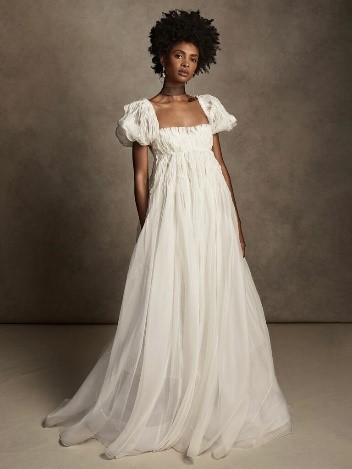
Joyous color, aquatic notions, natural ingredients, are among the themes for Spring/Summer 2023 fashion, home and beauty, according to Fashion Snoops. Add Bridgerton sleeves, and a bit of 80’s show-my-underwear to accommodate near future fashions.
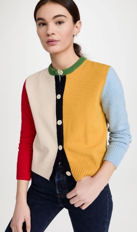
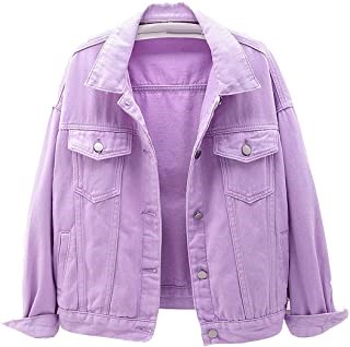
Here are samples of covers I just love with comparison fashion statements.
Mrs. March is a Hitchcockian story, with of course, an ironic ending. The cover attracted me to the story.
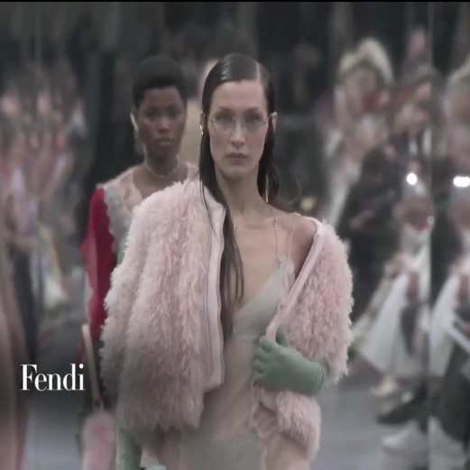
Yes, the pink coat is faux fur and the gloves are a similar color to Mrs. March’s.
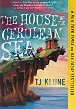
TJ Klune, it’s about time I read your work.
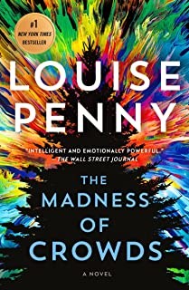
Why is the title of a murder mystery set in Canada, the calming color of blue?
Louise Penny delivers another great mystery, in which I swallowed a red herring hook, line, and sinker. The cover immediately caught my attention. Yet, it doesn’t keep with the simple is classier, less is better advice. I suggest the colors and their arrangement are strong hints of chaotic scenes in this story. I love this cover!
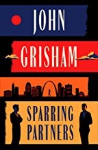
Grisham’s cover is just plain interesting. Different. Colors indicate trouble, warning, danger. Perhaps nostalgia. The dark blue? Maybe sadness, dark times, the unknown, something deep. I don’t know. What’s your opinion? Okay, John, I’ll read this one too.
The Lost Apothecary is a historical fiction debut by Penner. I thought it was well-done, a fast read, written with underlying tension, and had a profound ending. Way to go, Ms. Penner!
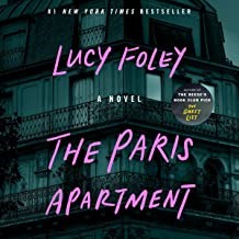
The Paris Apartment is on my to-read list!
Lavender is my fav color, so naturally, I studied these covers. I’d say, due only to the colors, that at least one female protagonist/antagonist is involved in these stories.
Notice the dark background on these covers. Sort of grounding, sort of draws you in, and certainly indicates mystery and death are afoot.
I’m reading The Personal Librarian now. What an incredible true character! Why the reddish lettering? I don’t know—yet. The off-white background? Several of the thrillers I located also had a whiteish cover. Cold? Pure? Aged, like old paint or marble?
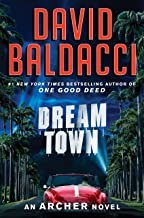
Anybody that knows me, knows I like Baldacci’s stories. This historical fiction with involving protagonist, Archer is on my to-read list.
Romance covers? You gotta have curvy lines! (Pun intended.) Except for Linda Howard and Julia Quinn
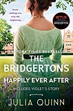
Notice the greens in this cover. According to https://www.colorpsychology.org
GREEN is a dominant color in nature which represents natural and forestial environments. Out of all the colors on the color wheel, green is regarded as the most restful and relaxing color for the human eye. Green symbolizes harmony, tranquility, peace. As a soothing, relaxing color, it enhances stability and endurance. It is most often associated with growth and renewal, and it promotes optimism, hopefulness, and balance. Negative attributes include stagnation and envy.
Using different shades of colors, (accompanied with font, titles and blurbs), can make a huge difference in what feeling you evoke from readers.
You may want to check out the following sites. Anybody know other cover-making websites?
https://bookcoverzone.com has an interesting display using the same book title, but varying the colors and backgrounds.
https://www.canva.com/ has great options.
Best of success to you and your book covers!






Very thoughtful, interesting post. I enjoyed it. If I ever self-publish again, I will definitely keep your comments in mind for designing the cover.